Design Your Personalised Wedding Cards Like A Pro - Here's How
Are you planning your personalised wedding cards? Here’s everything you need to know before you design your invitations!
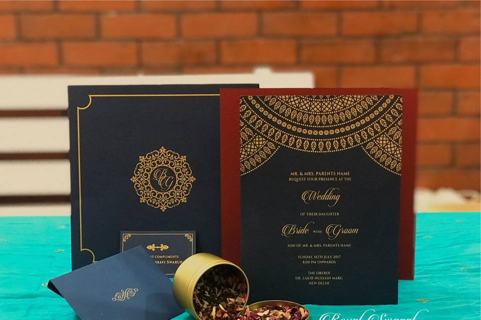
Every element of your wedding should be an expression of your personality and style. While the wedding dress, venue and décor are a part of the main festivities, the invitation is the opening act to the big day. Hence, the design of your wedding invitation should set the tone for the wedding and give your guests a sneak peek on what to expect.
For instance, if you are having a beach wedding, the invitation can include pastel shades and for a black-tie event, you can opt for darker tones. Personalised wedding cards are the first step to making your dream wedding a reality. Here are a few tips on how to create the perfect personalised wedding cards.
The Wedding Theme

Image Courtesy: Invitations by Dawn
Before you get into the details of the invitation, you need to define the style and theme of the wedding. This can either be a classy and elegant black-tie event or a casual and relaxed beach wedding. Having this sorted provides some perspective on the type of invitation you need.
The font and colours on your personalised wedding cards can change based on the theme. You can even get on Pinterest to gather some inspiration for your mood board.
Colours And Fonts

Image Courtesy: Invitations by Dawn
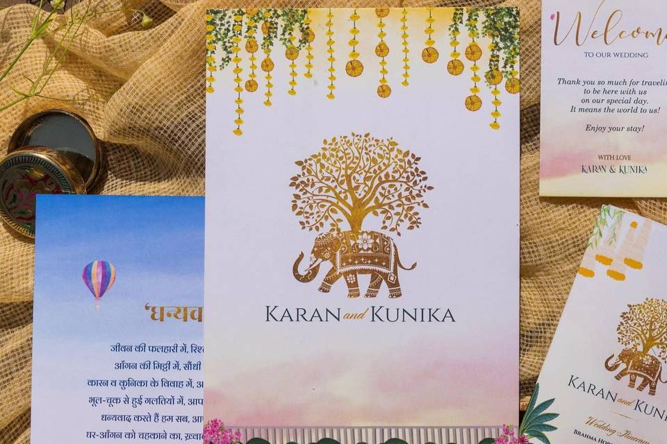
When planning a wedding, you are likely to have a theme that follows a certain colour palette. These colours help set the tone and are incorporated into almost every element of the wedding. Hence, when visualising the theme of the invitation, you can add these hues to the personalised wedding cards as well. The same pattern can be imitated on the accompanying invitations like the reception or the bridal shower.
Once the colours have been finalised, it’s time to think about the fonts. The font needs to seamlessly blend in with the colours to create the perfect masterpiece. Metallic fonts have always been a safe bet when it comes to invitations. It is also important that the information is easy to read against the colours in the background.
The Shape

Image Courtesy: Invitations by Dawn
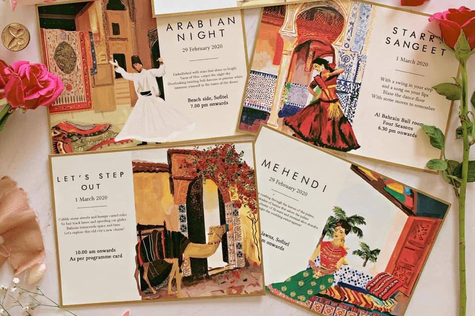
Most invitations follow the traditional size- 4.5 inches by 6.5 inches. However, there are no set rules when it comes to the shape of the card so the more innovative it is, the better. Channel your inner creativity with unique shapes like circles or rectangles.
This adds an element of surprise to your personalised wedding cards. However, an out-of-the-norm card shape also includes a non-traditional envelope so bear this in mind when choosing your card shape.
Create The Content

Image Courtesy: Invitations by Dawn
One of the most important elements of the wedding invitation is the content. There are a few etiquette rules to be followed when wording your invitation. The top of the card should feature the names of the bride and groom followed by the other details like the venue, date and time.
Make sure to spell out each detail on the card. In some cases, you can also include the family names saying ‘so and so... request your presence at the wedding.’ You can either consult with your invitation designer or get some inspiration online on what to include on your personalised wedding cards.
Make Sure It’s Legible
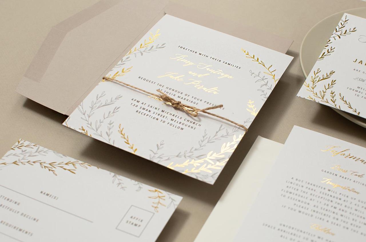
Image Courtesy: Paperlust
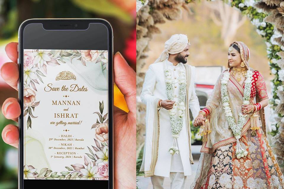
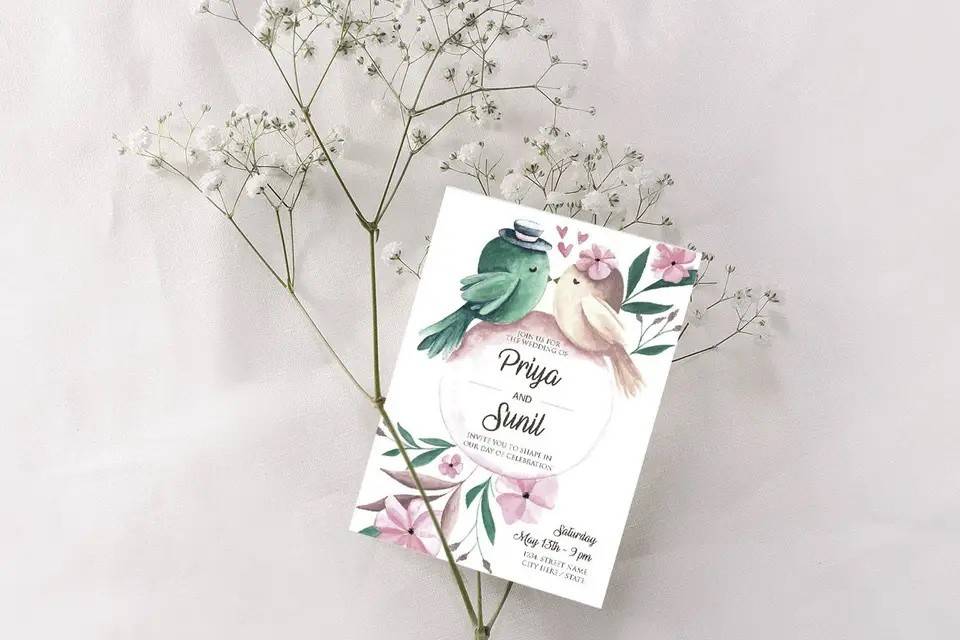
When choosing the colours for your cards, make sure the colours make the text on the card legible. Hence, don’t opt for dark text on a dark background or light text on a light background. If you are including pastel tones in your text make sure the background leans towards the darker colour.
In addition to the colours, the text itself needs to be easy to read so don’t opt for a typeface that is too scripted. The main goal of the invitation is to let your guests know the details of the wedding so make sure the font is clear and concise.
Keep The Invitation Light

Image Courtesy: Paperlust
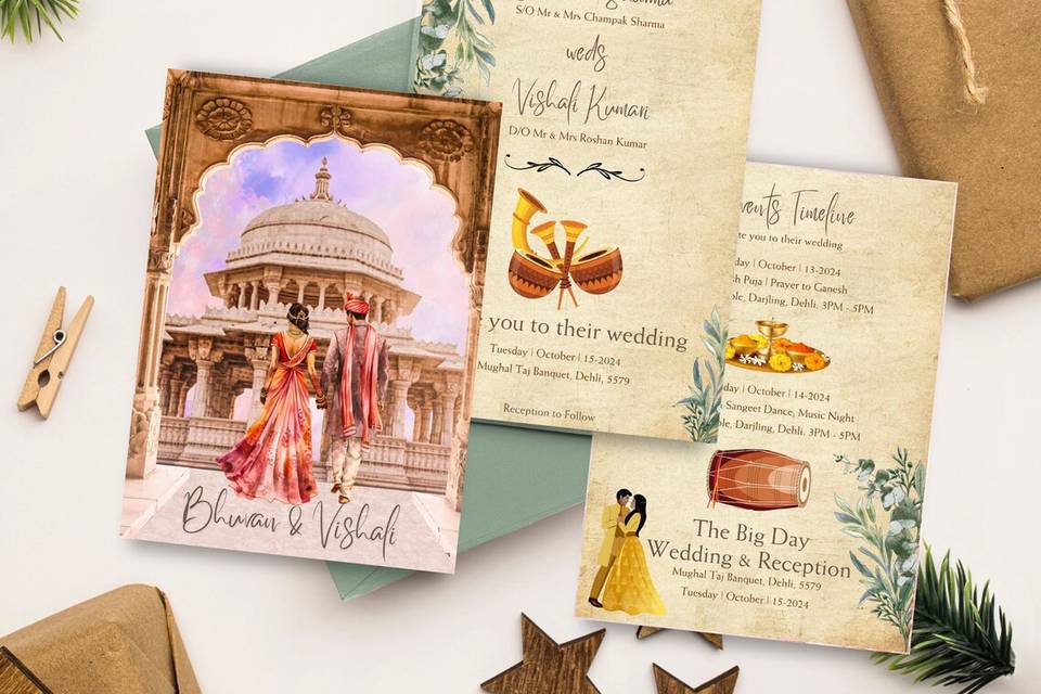
You may be tempted to add numerous details on the wedding invitation but your card only needs to include the most important points, namely, the date, time and venue. The bottom of the card can also include a few words on the dress code and the RSVP. At the end of the day your invitation should beautiful and elegant so try to keep the content to a minimum. If you would like to include directions to the wedding, you can do this on a separate card with a map. The same can be done for post-wedding events.
The Cost

Image Courtesy: Paperlust
The cost of wedding invitations can vary for each couple. It depends on numerous factors like the paper used, the font, typeface, colours and number of design elements included. Moreover, if you opt for personalised wedding cards that include pictures of you and your significant other, this can add on to the costs.
When planning a wedding you are likely to have a set budget so be mindful of the costs when finalising the details for the invitation. Have a basic idea of the level of customisation you want to incorporate in the invitation so you can budget accordingly.
Do A Guest Count

Image Courtesy: Sposto Photography
Not every guest on your list needs an invitation as some of them may live in the same house. So take a look at your guest list and group people based on households, this can also lower costs as it reduces the number of invitations you need to send.
The personalised wedding cards can be addressed to the family as a whole instead of each family member. However, make sure to order extra invitations in case you decide to expand your guest list or need to re-send some of the invites.
Your wedding invitation is the perfect way to give your guests a glimpse of the wedding. Since it is the first interaction with your attendees, it needs to resonate with the theme through the colours and fonts. Channel the inner-creative in you to design personalised wedding cards that showcase your unique personality and style. We hope these tips inspire you to create the perfect wedding invitation!
Have we missed out on any tips for personalised wedding cards? Let us know in the comments below!


